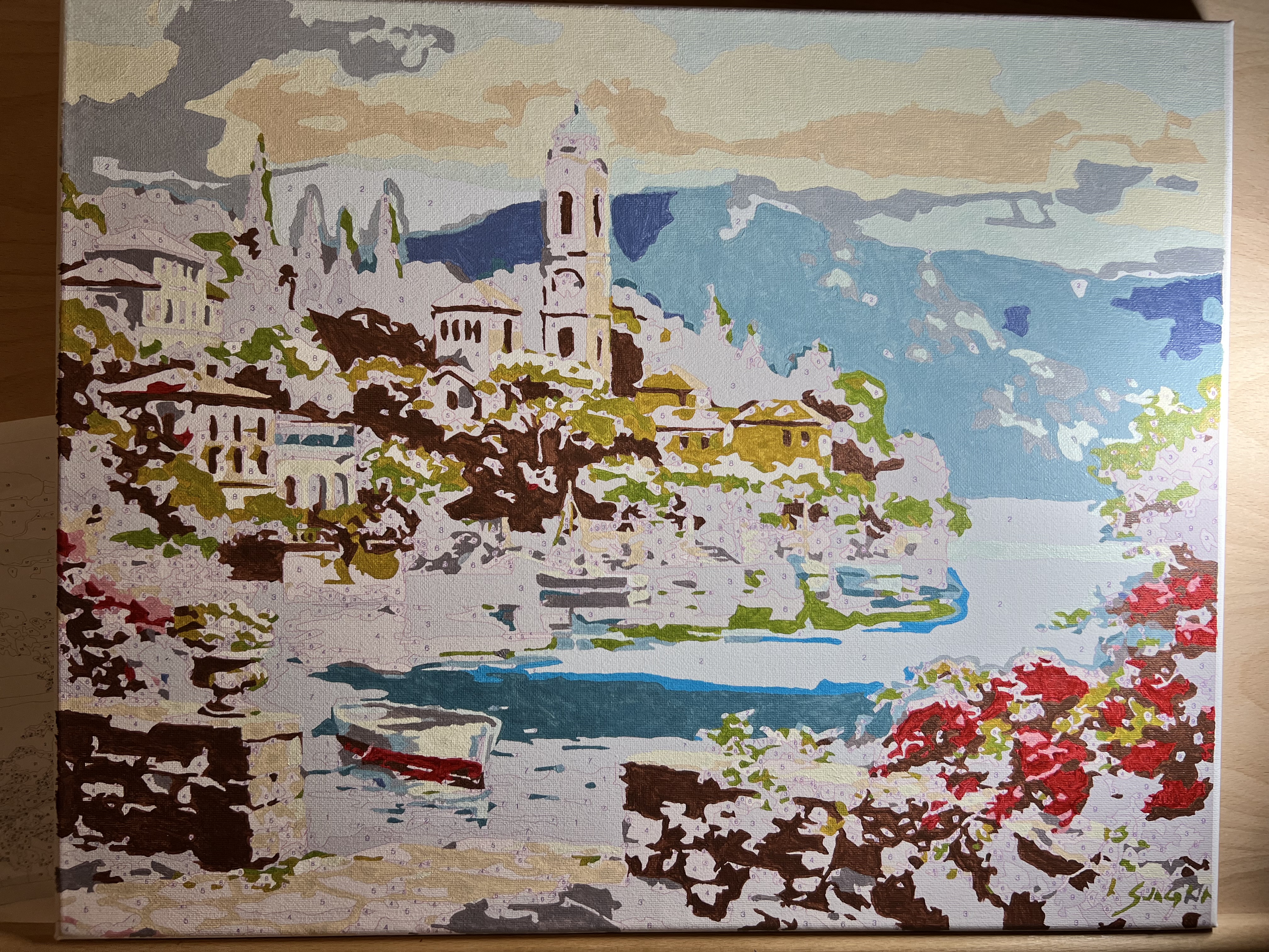
Okay, this one was tougher. I think it was a different company since the style is so different, but when I started making progress on it, this one my husband was actually interested in. I’m like, “Wait. You didn’t like the other two?” Little too abstract for him I guess.
Anyway, I blitzed through this one in maybe two weeks? After work and on weekends? I wish I could do these myself (i.e. paint and draw in real life), but for now, this checks the boxes of my personality:
- Checkbox (i.e. one color at a time)
- Paint
- End result = something creative
My only concern is that, at some point, I’m gonna run out of wall space. Wonder what people do with their paintings then???
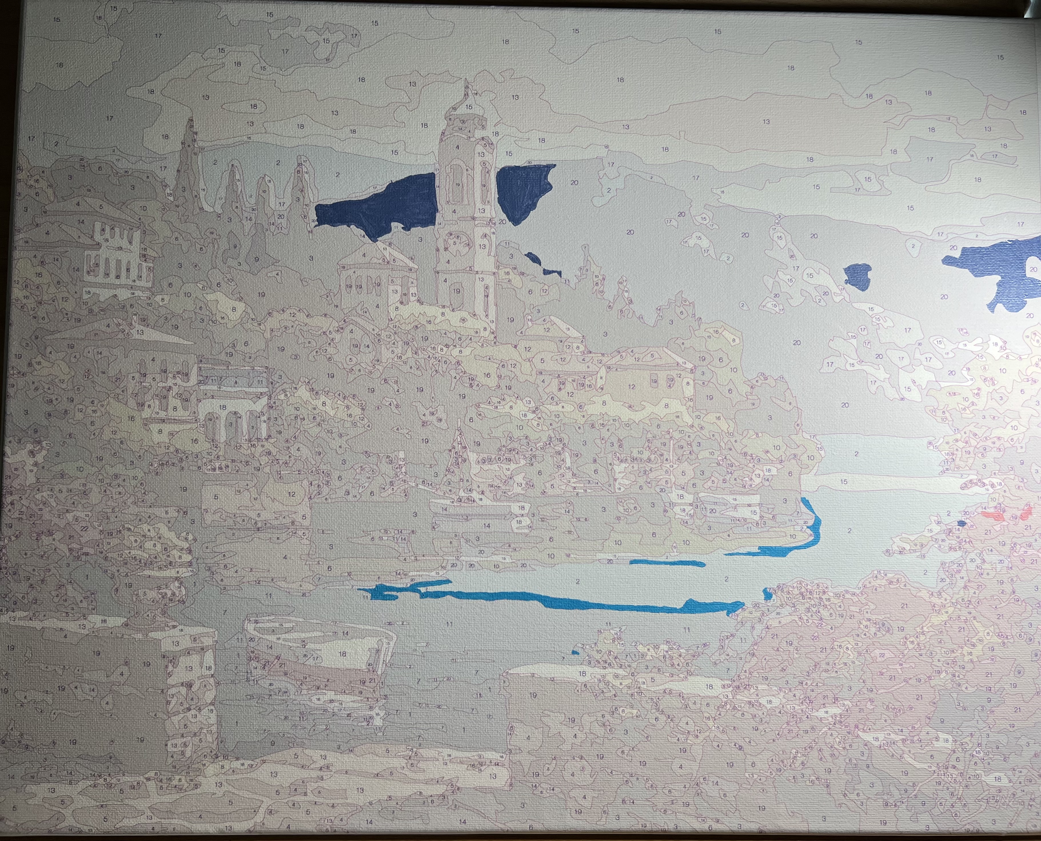
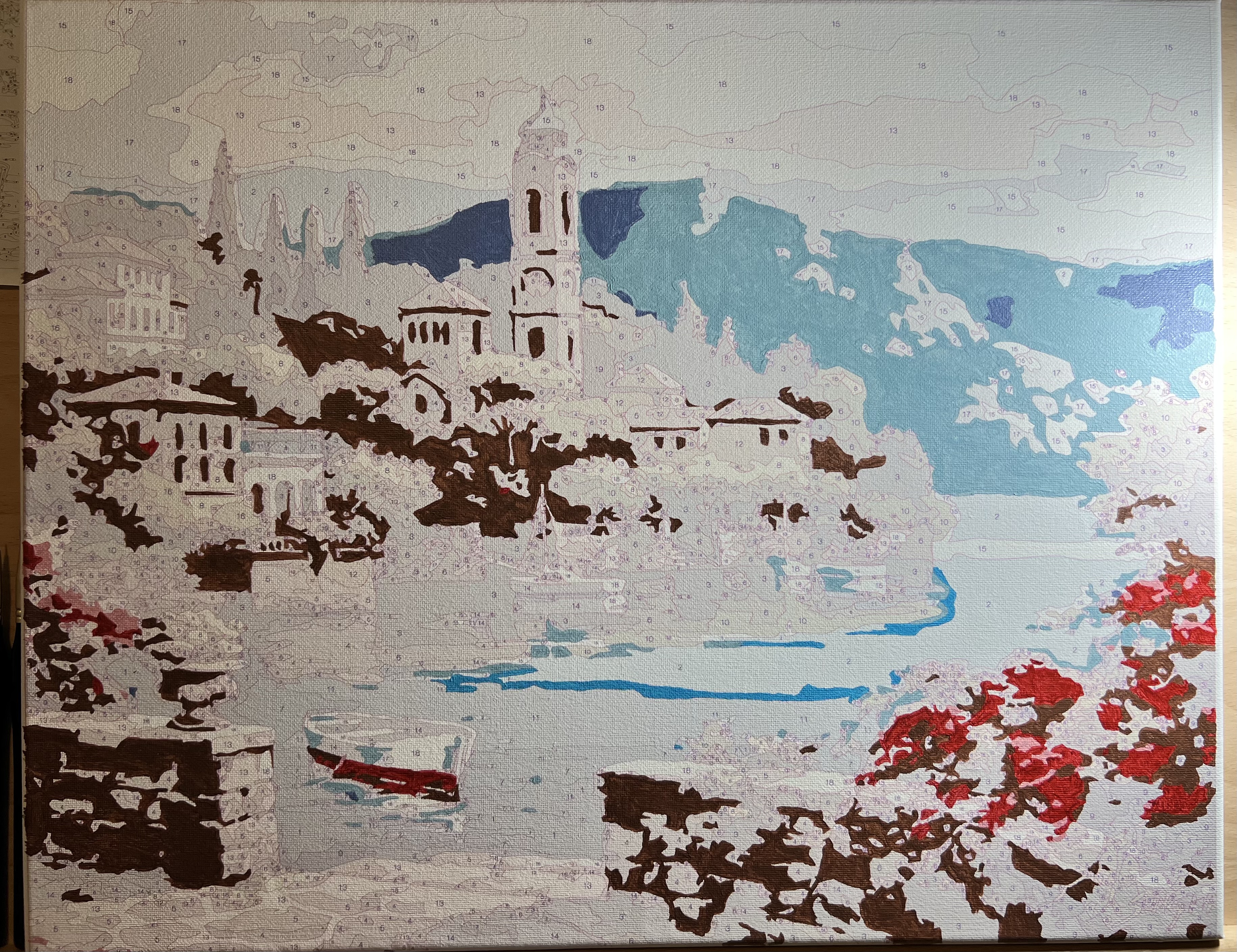
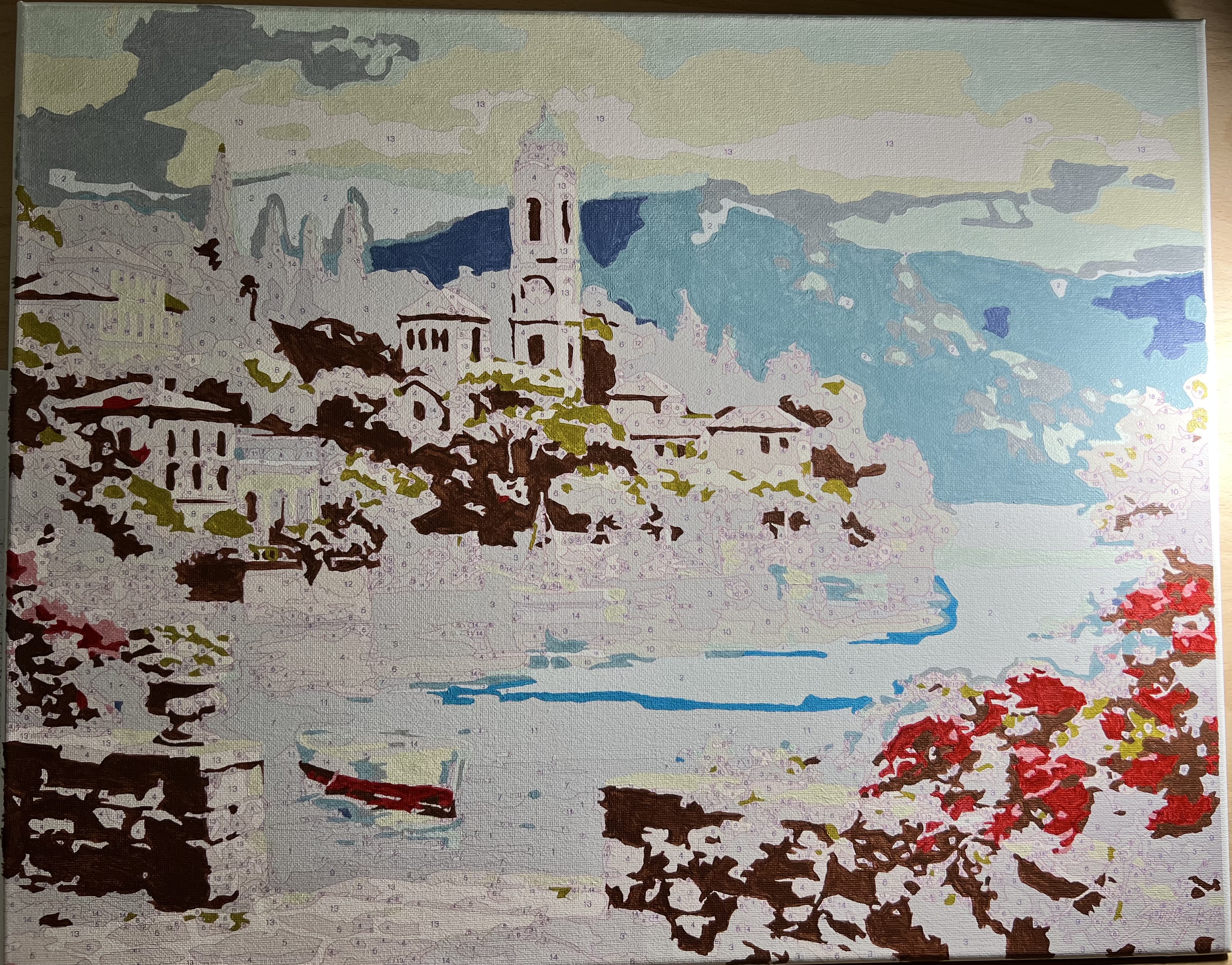
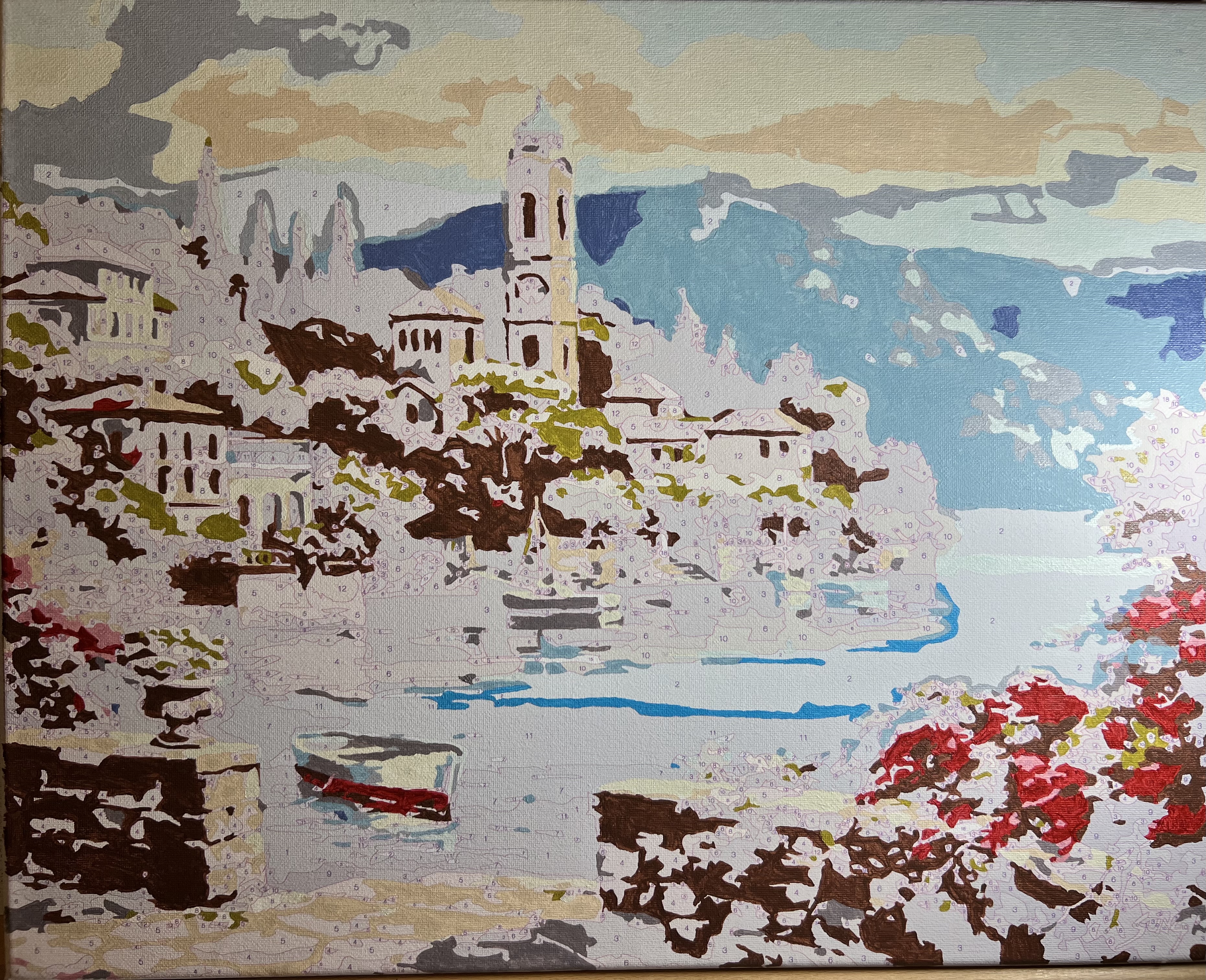
Note that this kind of painting pre-colors the background for you. So you can already see what it’s going to be. I’m still trying to decide if I like that. I think there were actually 24 colors, but while I was pasting these in and getting lost, I omitted a few thinking they were dupes. Typically the painting just has some really nuanced colors.
My only frustration on capturing these is that I typically paint at night and am always wanting to take a picture the SECOND I’m done a color. So you can’t see these in natural light. The glow on the right side is actually one of those “natural light” lamps for places like Alaska and stuff where it can be dark 23 hours a day. It’s supposed to help your mood, but it also pinch-hits for “natural daylight for a picture” if needs be. (Just not very well.)
Final Thoughts
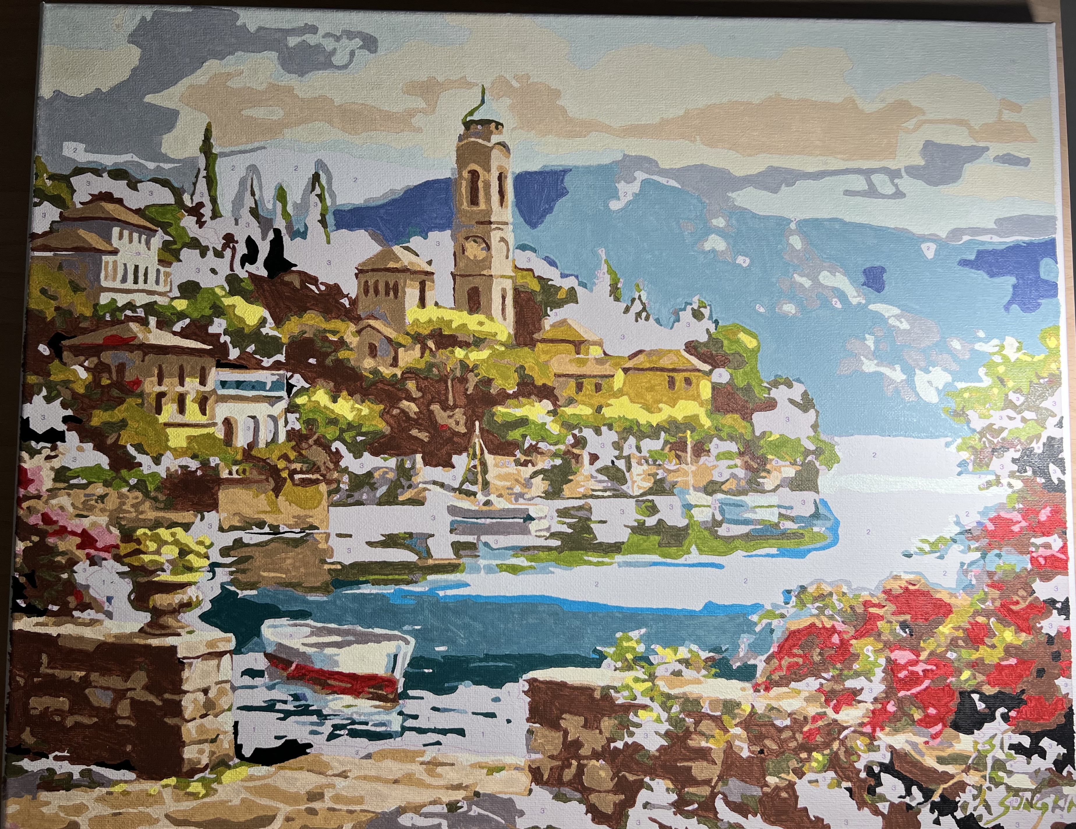
My husband LOVED this one. I was very proud of it. I will most likely frame it and put it up somewhere. The blocks of painting color were far smaller and required one of my smallest brushes in places. Let me just say those magnified glasses with the light? Best purchase I ever made.